Gloss labels are one of the first choices a packaging buyer faces when specifying labels for cannabis jars, tubes, or concentrate containers. The decision affects how a product reads on a retail shelf, how a label holds up during handling, and whether regulated text stays legible under store lighting. Getting the finish right before a bulk print run saves rework and reduces the risk of a label that looks wrong once applied. This article walks through the practical tradeoffs between matte and gloss finishes so you can make a defensible specification.
What Finish Actually Means on a Printed Label
Finish is the surface coating applied over printed label stock. It sits on top of the ink and base material and controls how light bounces off the label. Avery distinguishes matte finishes by their lower shine from glossy finishes by their higher reflectivity. Beyond that basic split, there is a spectrum. Semi-gloss and satin finishes sit between the two extremes. Knowing these middle options matters when your artwork mixes photography with dense regulatory text.
The base substrate matters too. A gloss label stock with a gloss laminate reads very differently from a gloss stock with no laminate. When you request samples, ask your label vendor to specify stock type, coating type, and laminate separately. Those three variables drive most of the visual and functional differences buyers run into.
How Gloss Labels Behave Under Retail Lighting
Gloss labels reflect ambient light back toward the viewer. Under overhead fluorescents or track lighting, this creates a bright, punchy look. Color photography and bold backgrounds read with intensity. That reflectivity is why gloss finishes appear across beverage, supplement, and premium cannabis product categories.
The tradeoff is glare. When a jar sits at an angle under a light source, a gloss label can produce a hot spot that obscures text or imagery. On a shelf, a small turn of the jar may hide a word behind a bright reflection. Test this in your actual retail environment before committing to a print run.
Cylindrical glass and plastic containers make glare worse. Curved surfaces concentrate reflected light into a narrow band across the label face. Flat panels can also reflect light sharply. Check each actual pack in the place where it will be displayed.
How Matte Labels Behave Under the Same Conditions
Matte labels scatter light rather than reflecting it in one direction. The result is a diffuse, even surface that reads well from multiple angles. Small text, ingredient lists, and regulated copy tend to stay legible regardless of where the container sits relative to the light source.
The visual tradeoff is saturation. Colors on a matte label appear slightly flatter than on a comparable gloss label. Photography with shadow detail can lose contrast. Bold flat graphics and typographic layouts often perform better on matte than photographic compositions built for a glossy look.
Some brands use a combination: matte base stock with a spot UV coating over the logo or brand mark. The spot coating adds a gloss accent to specific design elements without full-surface glare. Ask your label vendor about this option, since it adds a production step and affects per-unit cost.
Legibility of Regulated Text by Finish
Cannabis labels carry required information: strain name, weight, THC and CBD content, warning statements, license numbers, and batch or lot codes. That copy is often set in small point sizes to fit within a defined panel. Finish choice affects whether that text is readable under retail and inspection conditions.
Gloss labels can produce a reflection that reduces contrast between dark ink and a light background, especially at an oblique angle. A matte finish holds contrast more reliably across angles. If your label has a dark base with white reversed text, a gloss finish may create a shimmer that softens the edges of small characters.
Always confirm that your regulated label content meets your jurisdiction's requirements with your brand's compliance reviewer. Finish is a visual variable. It does not replace a compliance review of copy, font size, or placement.
Gloss Labels on Glass Versus Plastic Containers
Surface energy and texture affect how well a label adheres and how the finish reads after application. Glass jars typically have a smooth, consistent surface. Gloss finishes show with high fidelity on glass. The label sits flat, the coating performs as tested, and there is little texture to interrupt the reflective layer.
Plastic containers vary more. High-density polyethylene and polypropylene surfaces can have a slight texture or flex under pressure. A gloss label on a squeezable tube may develop micro-creases that scatter light in unintended ways and reduce the clean reflective look the finish was chosen to produce. Rigid plastic containers, such as straight-sided PET jars, behave more like glass and support gloss finishes reliably.
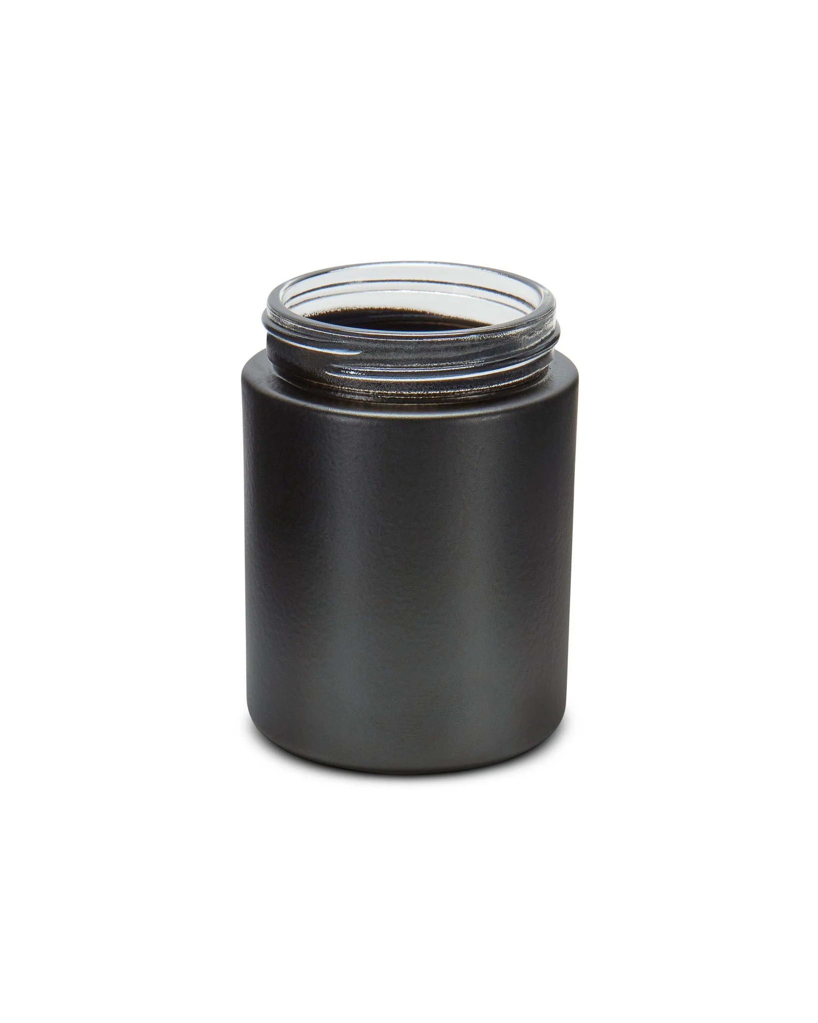
The 4oz Straight Sided Matte Black Glass Jar is a useful example of how container finish and label finish interact. A gloss label on a matte black glass surface creates high contrast: the jar body absorbs light while the label reflects it. Whether that contrast serves your brand is a design decision, but it shows why you need to evaluate both surfaces together, not in isolation.
Handling, Moisture, and Durability Differences
Labels on cannabis packaging encounter oils from handling, humidity in storage, and condensation if containers move between temperature zones. Finish affects how the label surface responds to each condition.
Gloss laminates typically resist surface moisture better than uncoated matte stocks. The laminate layer acts as a barrier, so smudging and finger oils wipe off more cleanly. An uncoated matte label can absorb oils and show fingerprints permanently, which degrades shelf appearance over a product's retail life.
Matte labels with an overlaminate perform comparably to gloss in moisture resistance. If durability matters and you prefer the matte look, specify a matte overlaminate rather than an uncoated matte face stock. The surface will still diffuse light but will resist handling damage much like a gloss label.
Heat and UV exposure are separate durability factors. Labels near lighting fixtures or in warm display cases can yellow, fade, or delaminate regardless of finish. Ask your label vendor for stock and laminate combinations rated for your expected storage conditions.
Checklist: Evaluating a Label Finish Sample Before Approval
Use this checklist when reviewing a label sample on your actual container. Complete all checks before approving artwork for a full print run.
- View the labeled container under the lighting used in your retail or display space, not just a desk lamp.
- Rotate the container through 90 degrees and check whether glare blocks any regulated text or brand element at any angle.
- Read the smallest required copy on the label from 18 inches and confirm it is legible.
- Press a fingertip firmly on the label surface, wipe, and note whether a mark remains.
- Expose the label to a damp surface for 60 seconds and check for edge lifting or surface change.
- Compare color saturation on the sample to your approved digital proof and note whether colors read significantly darker or flatter than expected.
- On curved sidewalls, check whether the finish reads consistently across the curve or concentrates glare in a single band.
- Confirm the label lies flat at seam edges and at the top and bottom of the panel.
- Review any regulatory panel under direct and angled light and confirm text contrast meets your compliance reviewer's standards.
This checklist applies to both gloss labels and matte labels. The specific items to watch differ by finish, but the method is the same.
A Hypothetical Sample Comparison Record
Suppose a buyer is preparing two label samples for the same 4oz round glass jar. The team measures the label panel from the actual jar rather than assuming its size from the stated capacity. This is a hypothetical review plan, not a report of Render tests.
Sample A uses a gloss finish. Sample B uses a matte finish. Record the full label construction for each one, including face stock, ink, adhesive and any overlaminate. A finish name alone does not describe the whole label.
Apply both labels to clean samples of the same jar. Use the same artwork and text size so a design change does not distort the comparison. Ask the printer whether the samples reflect the proposed production materials.
View both jars under the light used at the retail site. Turn each jar through the same positions. Record whether key words remain readable and where reflections appear. Do not decide from a single screen image or a single viewing angle.
Then check the handling conditions that the pack will actually face. Follow the supplier’s guidance for moisture and rub tests. Record marks, edge lift and any change in text clarity. A difference may come from the stock or coating, not just the matte or gloss finish.
Use a short record with the sample ID, material build, light setup, handling steps and observed result. Leave the result field blank until the team performs the check. Choose the sample that meets your own brief, or ask for a revised material if neither one does.
When to Request Samples Before Specifying a Gloss Label Finish
Samples are the only reliable way to confirm how a finish performs on your specific container. A finish that works well on a flat-sided rigid jar may read very differently on a narrow-diameter tube or a flexible squeeze bottle. Relying on a vendor's printed sample sheet, without applying the label to your actual container, adds risk to a print decision.
Request samples with your final artwork if possible, or a close version of it. Generic samples on plain stock give you surface feel but not a realistic preview of how your color palette, print density, and text layout will interact with the finish. A sample that includes your darkest background color and your smallest text block gives you the most useful information.
Browse the Render Packaging product catalog to identify the containers in your current or planned line, then coordinate sample labels matched to those specific dimensions. If your label requirements involve custom shapes, panel layouts, or a combination of finishes, custom packaging options are worth discussing before you commit to a specification.
Matching Finish to Container and Brand Intent
Finish choice is not purely aesthetic. It connects to legibility, durability, handling performance, and how the label reads across different retail environments. Gloss labels offer color saturation and surface protection. Matte labels offer consistent legibility and a tactile quality that some categories associate with premium positioning. Neither finish is better in every situation.
The practical method is to define your priority order before you request samples. If legibility of small regulated copy under variable lighting is your first concern, start with matte. If surface durability and color saturation matter more, start with gloss. Apply the checklist above to physical samples on your actual containers, record what you observe, and make the specification from that record rather than from general preference.

